/** * ICD Widgets - Core Styles * All styles needed for ICD widgets to render correctly. * ================================================= */ /* ================================================ GLOBAL: Remove blue focus ring on all buttons Fixes: hover blue outline/ring on all ICD widget buttons ================================================ */ .modalx .elementor-button:focus, .modalx .elementor-button:focus-visible, .modalx .elementor-button:active, .modalx .elementor-button:hover, .icd-wellcome-wrap .elementor-button:focus, .icd-wellcome-wrap .elementor-button:focus-visible, .icd-wellcome-wrap .elementor-button:active, .icd-wellcome-wrap .elementor-button:hover, .elementor-widget-akd_comment_kit .akd-btn-send:focus, .elementor-widget-akd_comment_kit .akd-btn-send:focus-visible, .elementor-widget-akd_comment_kit .akd-btn-send:active, .elementor-widget-akd_comment_kit .akd-btn-send:hover, .elementor-widget-akd_comment_kit button:focus, .elementor-widget-akd_comment_kit button:focus-visible, .elementor-widget-akd_comment_kit button:active, .elementor-widget-akd_comment_kit button:hover { outline: none !important; box-shadow: none !important; background-color: transparent !important; /* Remove mobile browser tap highlight (iOS Safari / Android Chrome) */ -webkit-tap-highlight-color: transparent !important; tap-highlight-color: transparent !important; user-select: none !important; -webkit-user-select: none !important; } /* --- Modalx: Fullscreen Cover Layer --- */ .modalx { position: fixed; z-index: 2000; width: 100%; height: 100%; top: 0; left: 0; background-color: transparent; background-size: cover; background-position: center; background-repeat: no-repeat; transform: translateY(0); } /* --- Overlay: Dark Background --- */ .overlayy { background-color: #000; position: relative; width: 100%; height: 100%; z-index: 2001; top: 0; opacity: 0.7; left: 0; } /* Override overlayy for wellcome (position:fixed parent) */ .icd-wellcome-wrap > .overlayy { position: absolute !important; width: 100% !important; height: 100% !important; } /* --- Content: Content Container --- */ .content-modalx { background-color: transparent; position: fixed; width: 100%; height: 100%; z-index: 2002; top: 10px; color: #fff; left: 0; } /* --- Info Modalx: Center Align Content --- */ .info_modalx { width: 100%; display: flex; height: 100%; flex-direction: column; justify-content: center; } .info_modalx > div { width: auto; text-align: center; height: auto; } /* --- Remove Modals: Slide-out Animation --- */ .removeModals { transform: translateY(200%); transition: 0.4s ease-in-out; } /* --- Text Styles (mirrored from wdp.css) --- */ .icd-text { color: #fff; font-size: 18px; text-align: center; } .icd-dear { color: #fff; font-size: 18px; text-align: center; } .icd-name { font-weight: 600; color: #fff; font-size: 25px; } .icd-mempelai { color: #fff; font-size: 14px; } .icd-txt-the-wedding { color: #fff; font-size: 14px; } .icd-tgl { color: #fff; font-size: 18px; } .icd-keterangan { color: #fff; font-size: 12px; } .icd-button-wrapper { text-align: center; } /* --- QR Button (inline style in render) --- */ .elementor-button-qr { display: inline-block; line-height: 1; background-color: #818a91; font-size: 15px; padding: 12px 24px; border-radius: 3px; color: #fff; fill: #fff; text-align: center; -webkit-transition: all .3s; -o-transition: all .3s; transition: all .3s; } /* --- ICD Invitation Styles (icd-* prefix variants) --- */ .icd-txt-the-wedding { color: #fff; font-size: 14px; } .icd-mempelai { color: #fff; font-size: 14px; } .icd-tgl { color: #fff; font-size: 18px; } .icd-dear { color: #fff; font-size: 18px; text-align: center; } .icd-name { font-weight: 600; color: #fff; font-size: 25px; } .icd-text { color: #fff; font-size: 18px; text-align: center; } .icd-keterangan { color: #fff; font-size: 12px; } .icd-button-wrapper { text-align: center; } .icd-button-qr { display: inline-block; line-height: 1; background-color: #818a91; font-size: 15px; padding: 12px 24px; border-radius: 3px; color: #fff; fill: #fff; text-align: center; -webkit-transition: all .3s; -o-transition: all .3s; transition: all .3s; } /* ================================================ ELEMENTOR EDITOR ISOLATION When dragging cover into editor, modalx overlays must NOT be fixed-positioned — convert to normal flow so editor remains responsive. NOTE: Elementor renders preview inside an iframe. The root of that iframe is body.elementor-editor-active. We use position:fixed (same as frontend) so modalx escapes the widget container and fills the iframe viewport. WDP does the same — no editor-specific override. ================================================ */ body.elementor-editor-active .modalx, body.elementor-editor-preview .modalx { position: fixed !important; z-index: 9999 !important; width: 100vw !important; height: 100vh !important; min-height: 100vh !important; top: 0 !important; bottom: auto !important; left: 0 !important; right: auto !important; background-image: none !important; background-color: #111 !important; transform: none !important; overflow: hidden !important; } body.elementor-editor-active .modalx .overlayy, body.elementor-editor-preview .modalx .overlayy { position: absolute !important; width: 100% !important; height: 100% !important; top: 0 !important; left: 0 !important; z-index: 9999 !important; background-color: #000 !important; } body.elementor-editor-active .modalx .content-modalx, body.elementor-editor-preview .modalx .content-modalx { position: absolute !important; width: 100% !important; height: 100% !important; top: 0 !important; left: 0 !important; z-index: 10000 !important; color: #fff !important; } body.elementor-editor-active .modalx .info_modalx, body.elementor-editor-preview .modalx .info_modalx { display: flex !important; position: relative !important; width: 100% !important; height: 100% !important; z-index: 10001 !important; } /* ================================================ WELLCOME WIDGET EDITOR ISOLATION Same fullscreen treatment as cover widget. When dragged into Elementor editor, wellcome-wrap becomes fixed and fills the entire iframe viewport. ================================================ */ body.elementor-editor-active .icd-wellcome-wrap, body.elementor-editor-preview .icd-wellcome-wrap { position: fixed !important; z-index: 9999 !important; width: 100vw !important; height: 100vh !important; min-height: 100vh !important; top: 0 !important; bottom: auto !important; left: 0 !important; right: auto !important; background-color: #111 !important; overflow: hidden !important; } body.elementor-editor-active .icd-wellcome-content, body.elementor-editor-preview .icd-wellcome-content { position: absolute !important; width: 100% !important; height: 100% !important; top: 0 !important; left: 0 !important; z-index: 10000 !important; justify-content: center !important; align-items: center !important; padding: 40px 20px !important; } /* ================================================ COVER BUTTON ICON SIZE Match exact icon size from WDP fullscreen. Icon should be inline with text, not oversized. ================================================ */ .modalx .elementor-button { display: inline-flex !important; align-items: center; justify-content: center; gap: 8px; padding: 10px 24px; font-size: 14px; line-height: 1; border: none; border-radius: 0; cursor: pointer; text-decoration: none; white-space: nowrap; transition: background-color 0.3s ease, color 0.3s ease; /* Remove default browser/Elementor blue focus ring on hover/focus */ outline: none !important; box-shadow: none !important; } .modalx .elementor-button:focus, .modalx .elementor-button:focus-visible, .modalx .elementor-button:active { background-color: transparent !important; outline: none !important; box-shadow: none !important; -webkit-tap-highlight-color: transparent !important; tap-highlight-color: transparent !important; } .modalx .elementor-button-icon, .modalx .elementor-button-icon i, .modalx .elementor-button-icon svg { display: inline-block; width: auto !important; height: auto !important; font-size: 16px !important; line-height: 1; vertical-align: middle; } /* QR Button icon size in cover modalx */ .modalx .elementor-button-qr { display: inline-flex !important; align-items: center; justify-content: center; gap: 6px; padding: 8px 16px; font-size: 13px; line-height: 1; border: none; border-radius: 0; /* Remove default browser/Elementor blue focus ring on hover/focus */ outline: none !important; box-shadow: none !important; } .modalx .elementor-button-qr:focus, .modalx .elementor-button-qr:focus-visible, .modalx .elementor-button-qr:active { background-color: #818a91 !important; outline: none !important; box-shadow: none !important; -webkit-tap-highlight-color: transparent !important; tap-highlight-color: transparent !important; } .modalx .elementor-button-qr .elementor-button-icon, .modalx .elementor-button-qr .elementor-button-icon i, .modalx .elementor-button-qr .elementor-button-icon svg { display: inline-block; width: auto !important; height: auto !important; font-size: 14px !important; line-height: 1; vertical-align: middle; } /* ================================================ ICD WELLCOME WIDGET — FULLSCREEN COVER (FRONTEND) Mirrors the cover widget: position fixed full viewport. Frontend = fixed to fill screen (same as editor preview). ================================================ */ .icd-wellcome-wrap { position: fixed !important; z-index: 2000 !important; width: 100vw !important; height: 100vh !important; top: 0 !important; left: 0 !important; background-color: #111 !important; background-size: cover !important; background-position: center !important; background-repeat: no-repeat !important; overflow: hidden !important; } .icd-wellcome-content { position: absolute !important; z-index: 2001 !important; width: 100% !important; height: 100% !important; top: 0 !important; left: 0 !important; display: flex !important; flex-direction: column !important; align-items: center !important; justify-content: center !important; padding: 40px 20px !important; text-align: center !important; color: #fff !important; } .icd-wellcome-content .elementor-image img, .icd-wellcome-content .img { display: inline-block !important; width: 100% !important; max-width: 100% !important; height: auto !important; margin-bottom: 15px !important; } .icd-wellcome-content .elementor-image { width: 100% !important; text-align: center !important; } .icd-wellcome-content .icd-txt-the-wedding { color: #fff; font-size: 14px; text-align: center; margin-bottom: 5px; } .icd-wellcome-content .icd-mempelai { color: #fff; font-size: 25px; font-weight: 600; text-align: center; margin-bottom: 5px; } .icd-wellcome-content .icd-tgl { color: #fff; font-size: 18px; text-align: center; margin-bottom: 10px; } .icd-wellcome-content .icd-dear { color: #fff; font-size: 18px; text-align: center; margin-bottom: 5px; } .icd-wellcome-content .icd-name { color: #fff; font-size: 18px; font-weight: 600; text-align: center; margin-bottom: 10px; } .icd-wellcome-content .icd-text { color: #fff; font-size: 12px; text-align: center; margin-bottom: 20px; padding: 0 10px; } .icd-wellcome-content .icd-keterangan { color: #fff; font-size: 12px; text-align: center; margin-top: 10px; } .icd-wellcome-content .icd-button-wrapper { text-align: center; margin-top: 15px; } .icd-wellcome-content .icd-button-qr { text-align: center; margin-top: 10px; } .icd-wellcome-content .elementor-button { display: inline-flex !important; align-items: center; justify-content: center; gap: 8px; padding: 10px 24px; font-size: 14px; line-height: 1; border: 1px solid rgba(255,255,255,0.3); border-radius: 0; color: #fff; background-color: transparent; cursor: pointer; transition: background-color 0.3s ease, color 0.3s ease; /* Remove default browser/Elementor blue focus ring on hover/focus */ outline: none !important; box-shadow: none !important; } .icd-wellcome-content .elementor-button:hover { background-color: rgba(255,255,255,0.15); outline: none !important; box-shadow: none !important; } .icd-wellcome-content .elementor-button:focus, .icd-wellcome-content .elementor-button:focus-visible, .icd-wellcome-content .elementor-button:active { background-color: transparent !important; outline: none !important; box-shadow: none !important; -webkit-tap-highlight-color: transparent !important; tap-highlight-color: transparent !important; } .icd-wellcome-content .elementor-button-icon, .icd-wellcome-content .elementor-button-icon i, .icd-wellcome-content .elementor-button-icon svg { display: inline-block; width: auto !important; height: auto !important; font-size: 16px !important; line-height: 1; vertical-align: middle; } .icd-wellcome-content .elementor-button-qr { display: inline-flex !important; align-items: center; justify-content: center; gap: 6px; padding: 8px 16px; font-size: 13px; line-height: 1; border: none; color: #fff; background-color: #818a91; cursor: pointer; /* Remove default browser/Elementor blue focus ring on hover/focus */ outline: none !important; box-shadow: none !important; } .icd-wellcome-content .elementor-button-qr:focus, .icd-wellcome-content .elementor-button-qr:focus-visible, .icd-wellcome-content .elementor-button-qr:active { background-color: #818a91 !important; outline: none !important; box-shadow: none !important; -webkit-tap-highlight-color: transparent !important; tap-highlight-color: transparent !important; } .icd-wellcome-content .elementor-button-qr .elementor-button-icon i, .icd-wellcome-content .elementor-button-qr .elementor-button-icon svg { font-size: 14px !important; } /* ================================================ ICD COPY WIDGET — BUTTON ICON Icon sizing/spacing for the standalone copy button (the .modalx rules only cover cover-widget buttons). Elementor 3.x Icons_Manager::render_icon() outputs inline SVG (not ) so we need explicit SVG sizing. Without this, icons appear at 0×0 or full container size. ================================================ */ .elementor-button-wrapper .elementor-button-icon, .elementor-button-wrapper .elementor-button-icon i, .elementor-button-wrapper .elementor-button-icon svg { display: inline-block; width: 16px !important; height: 16px !important; font-size: 16px !important; line-height: 1; vertical-align: middle; } /* ================================================ ICD COUNTDOWN WIDGET STYLES 100% mirrors WDP wdp.css countdown section. Uses display:table (WDP's original layout) so it works reliably in both frontend and editor. IMPORTANT: Selectors match Elementor generated styles exactly. Structural layout uses !important. Visual properties use NO !important. Elementor generates {WRAPPER}.wpkoi-elements-countdown-item > div as (0,2,1). External stylesheet comes BEFORE Elementor dynamic injection in the , so Elementor always wins (correct behavior). !important ONLY on structural layout (display, table-layout) to prevent editor/other plugins override. ================================================ */ .wpkoi-elements-countdown-wrapper { width: 100%; } /* Structural layout — !important keeps table layout intact in all contexts */ ul.wpkoi-elements-countdown-items { list-style: none !important; margin: 0 !important; padding: 0 !important; display: table !important; table-layout: fixed !important; width: 100% !important; } /* Structural layout — !important keeps table-cell intact */ ul.wpkoi-elements-countdown-items > li { list-style: none !important; margin: 0 !important; padding: 0 !important; display: table-cell !important; position: relative !important; } /* Visual — NO !important. Selector matches Elementor: .wpkoi-elements-countdown-item > div (0,2,1) */ .wpkoi-elements-countdown-item > div { text-align: center; padding: 20px; } /* Visual label view — NO !important */ .wpkoi-elements-countdown-label-block .wpkoi-elements-countdown-digits, .wpkoi-elements-countdown-label-block .wpkoi-elements-countdown-label { display: block; text-align: center; } .wpkoi-elements-countdown-label-inline .wpkoi-elements-countdown-digits, .wpkoi-elements-countdown-label-inline .wpkoi-elements-countdown-label { display: inline; text-align: center; } /* Visual digits — NO !important so font-size/color controls work */ .wpkoi-elements-countdown-digits { font-size: 50px; line-height: 1; } /* Visual label — NO !important so color/font controls work */ .wpkoi-elements-countdown-label { font-size: 18px; line-height: 1; color: #fff; } /* Separator — position structural, content visual */ .wpkoi-elements-countdown-show-separator .wpkoi-elements-countdown-digits::after { content: ":"; position: absolute; left: 98%; z-index: 9999; } .wpkoi-elements-countdown-item:last-child .wpkoi-elements-countdown-digits::after { display: none; } /* Visual background — NO !important so Elementor color control works. Selector matches Elementor generated: .wpkoi-elements-countdown-item > div (0,2,1). External stylesheet loads BEFORE Elementor dynamic injection → Elementor wins. */ .wpkoi-elements-countdown-item > div { background: #111; } /* Mobile: wrap to 2x2 */ @media (max-width: 480px) { ul.wpkoi-elements-countdown-items { display: block !important; } ul.wpkoi-elements-countdown-items > li { display: inline-block !important; width: 50% !important; vertical-align: top !important; } }

ANDY

THE WEDDING OF

ZHEA

Kepada Yth: Bpk/Ibu/Saudara/I

Tamu Undangan

*) Mohon maaf apabila ada kesalahan penulisan nama/gelar

“Maha Suci Allah yang telah menciptakan manusia dengan berpasang-pasangan. Dengan memohon Rahmat dan Ridho Allah SWT, kami bermaksud mengundang Saudara/i dalam acara resepsi pernikahan kami.”

/** * ICD Widgets - Core Styles * All styles needed for ICD widgets to render correctly. * ================================================= */ /* ================================================ GLOBAL: Remove blue focus ring on all buttons Fixes: hover blue outline/ring on all ICD widget buttons ================================================ */ .modalx .elementor-button:focus, .modalx .elementor-button:focus-visible, .modalx .elementor-button:active, .modalx .elementor-button:hover, .icd-wellcome-wrap .elementor-button:focus, .icd-wellcome-wrap .elementor-button:focus-visible, .icd-wellcome-wrap .elementor-button:active, .icd-wellcome-wrap .elementor-button:hover, .elementor-widget-akd_comment_kit .akd-btn-send:focus, .elementor-widget-akd_comment_kit .akd-btn-send:focus-visible, .elementor-widget-akd_comment_kit .akd-btn-send:active, .elementor-widget-akd_comment_kit .akd-btn-send:hover, .elementor-widget-akd_comment_kit button:focus, .elementor-widget-akd_comment_kit button:focus-visible, .elementor-widget-akd_comment_kit button:active, .elementor-widget-akd_comment_kit button:hover { outline: none !important; box-shadow: none !important; background-color: transparent !important; /* Remove mobile browser tap highlight (iOS Safari / Android Chrome) */ -webkit-tap-highlight-color: transparent !important; tap-highlight-color: transparent !important; user-select: none !important; -webkit-user-select: none !important; } /* --- Modalx: Fullscreen Cover Layer --- */ .modalx { position: fixed; z-index: 2000; width: 100%; height: 100%; top: 0; left: 0; background-color: transparent; background-size: cover; background-position: center; background-repeat: no-repeat; transform: translateY(0); } /* --- Overlay: Dark Background --- */ .overlayy { background-color: #000; position: relative; width: 100%; height: 100%; z-index: 2001; top: 0; opacity: 0.7; left: 0; } /* Override overlayy for wellcome (position:fixed parent) */ .icd-wellcome-wrap > .overlayy { position: absolute !important; width: 100% !important; height: 100% !important; } /* --- Content: Content Container --- */ .content-modalx { background-color: transparent; position: fixed; width: 100%; height: 100%; z-index: 2002; top: 10px; color: #fff; left: 0; } /* --- Info Modalx: Center Align Content --- */ .info_modalx { width: 100%; display: flex; height: 100%; flex-direction: column; justify-content: center; } .info_modalx > div { width: auto; text-align: center; height: auto; } /* --- Remove Modals: Slide-out Animation --- */ .removeModals { transform: translateY(200%); transition: 0.4s ease-in-out; } /* --- Text Styles (mirrored from wdp.css) --- */ .icd-text { color: #fff; font-size: 18px; text-align: center; } .icd-dear { color: #fff; font-size: 18px; text-align: center; } .icd-name { font-weight: 600; color: #fff; font-size: 25px; } .icd-mempelai { color: #fff; font-size: 14px; } .icd-txt-the-wedding { color: #fff; font-size: 14px; } .icd-tgl { color: #fff; font-size: 18px; } .icd-keterangan { color: #fff; font-size: 12px; } .icd-button-wrapper { text-align: center; } /* --- QR Button (inline style in render) --- */ .elementor-button-qr { display: inline-block; line-height: 1; background-color: #818a91; font-size: 15px; padding: 12px 24px; border-radius: 3px; color: #fff; fill: #fff; text-align: center; -webkit-transition: all .3s; -o-transition: all .3s; transition: all .3s; } /* --- ICD Invitation Styles (icd-* prefix variants) --- */ .icd-txt-the-wedding { color: #fff; font-size: 14px; } .icd-mempelai { color: #fff; font-size: 14px; } .icd-tgl { color: #fff; font-size: 18px; } .icd-dear { color: #fff; font-size: 18px; text-align: center; } .icd-name { font-weight: 600; color: #fff; font-size: 25px; } .icd-text { color: #fff; font-size: 18px; text-align: center; } .icd-keterangan { color: #fff; font-size: 12px; } .icd-button-wrapper { text-align: center; } .icd-button-qr { display: inline-block; line-height: 1; background-color: #818a91; font-size: 15px; padding: 12px 24px; border-radius: 3px; color: #fff; fill: #fff; text-align: center; -webkit-transition: all .3s; -o-transition: all .3s; transition: all .3s; } /* ================================================ ELEMENTOR EDITOR ISOLATION When dragging cover into editor, modalx overlays must NOT be fixed-positioned — convert to normal flow so editor remains responsive. NOTE: Elementor renders preview inside an iframe. The root of that iframe is body.elementor-editor-active. We use position:fixed (same as frontend) so modalx escapes the widget container and fills the iframe viewport. WDP does the same — no editor-specific override. ================================================ */ body.elementor-editor-active .modalx, body.elementor-editor-preview .modalx { position: fixed !important; z-index: 9999 !important; width: 100vw !important; height: 100vh !important; min-height: 100vh !important; top: 0 !important; bottom: auto !important; left: 0 !important; right: auto !important; background-image: none !important; background-color: #111 !important; transform: none !important; overflow: hidden !important; } body.elementor-editor-active .modalx .overlayy, body.elementor-editor-preview .modalx .overlayy { position: absolute !important; width: 100% !important; height: 100% !important; top: 0 !important; left: 0 !important; z-index: 9999 !important; background-color: #000 !important; } body.elementor-editor-active .modalx .content-modalx, body.elementor-editor-preview .modalx .content-modalx { position: absolute !important; width: 100% !important; height: 100% !important; top: 0 !important; left: 0 !important; z-index: 10000 !important; color: #fff !important; } body.elementor-editor-active .modalx .info_modalx, body.elementor-editor-preview .modalx .info_modalx { display: flex !important; position: relative !important; width: 100% !important; height: 100% !important; z-index: 10001 !important; } /* ================================================ WELLCOME WIDGET EDITOR ISOLATION Same fullscreen treatment as cover widget. When dragged into Elementor editor, wellcome-wrap becomes fixed and fills the entire iframe viewport. ================================================ */ body.elementor-editor-active .icd-wellcome-wrap, body.elementor-editor-preview .icd-wellcome-wrap { position: fixed !important; z-index: 9999 !important; width: 100vw !important; height: 100vh !important; min-height: 100vh !important; top: 0 !important; bottom: auto !important; left: 0 !important; right: auto !important; background-color: #111 !important; overflow: hidden !important; } body.elementor-editor-active .icd-wellcome-content, body.elementor-editor-preview .icd-wellcome-content { position: absolute !important; width: 100% !important; height: 100% !important; top: 0 !important; left: 0 !important; z-index: 10000 !important; justify-content: center !important; align-items: center !important; padding: 40px 20px !important; } /* ================================================ COVER BUTTON ICON SIZE Match exact icon size from WDP fullscreen. Icon should be inline with text, not oversized. ================================================ */ .modalx .elementor-button { display: inline-flex !important; align-items: center; justify-content: center; gap: 8px; padding: 10px 24px; font-size: 14px; line-height: 1; border: none; border-radius: 0; cursor: pointer; text-decoration: none; white-space: nowrap; transition: background-color 0.3s ease, color 0.3s ease; /* Remove default browser/Elementor blue focus ring on hover/focus */ outline: none !important; box-shadow: none !important; } .modalx .elementor-button:focus, .modalx .elementor-button:focus-visible, .modalx .elementor-button:active { background-color: transparent !important; outline: none !important; box-shadow: none !important; -webkit-tap-highlight-color: transparent !important; tap-highlight-color: transparent !important; } .modalx .elementor-button-icon, .modalx .elementor-button-icon i, .modalx .elementor-button-icon svg { display: inline-block; width: auto !important; height: auto !important; font-size: 16px !important; line-height: 1; vertical-align: middle; } /* QR Button icon size in cover modalx */ .modalx .elementor-button-qr { display: inline-flex !important; align-items: center; justify-content: center; gap: 6px; padding: 8px 16px; font-size: 13px; line-height: 1; border: none; border-radius: 0; /* Remove default browser/Elementor blue focus ring on hover/focus */ outline: none !important; box-shadow: none !important; } .modalx .elementor-button-qr:focus, .modalx .elementor-button-qr:focus-visible, .modalx .elementor-button-qr:active { background-color: #818a91 !important; outline: none !important; box-shadow: none !important; -webkit-tap-highlight-color: transparent !important; tap-highlight-color: transparent !important; } .modalx .elementor-button-qr .elementor-button-icon, .modalx .elementor-button-qr .elementor-button-icon i, .modalx .elementor-button-qr .elementor-button-icon svg { display: inline-block; width: auto !important; height: auto !important; font-size: 14px !important; line-height: 1; vertical-align: middle; } /* ================================================ ICD WELLCOME WIDGET — FULLSCREEN COVER (FRONTEND) Mirrors the cover widget: position fixed full viewport. Frontend = fixed to fill screen (same as editor preview). ================================================ */ .icd-wellcome-wrap { position: fixed !important; z-index: 2000 !important; width: 100vw !important; height: 100vh !important; top: 0 !important; left: 0 !important; background-color: #111 !important; background-size: cover !important; background-position: center !important; background-repeat: no-repeat !important; overflow: hidden !important; } .icd-wellcome-content { position: absolute !important; z-index: 2001 !important; width: 100% !important; height: 100% !important; top: 0 !important; left: 0 !important; display: flex !important; flex-direction: column !important; align-items: center !important; justify-content: center !important; padding: 40px 20px !important; text-align: center !important; color: #fff !important; } .icd-wellcome-content .elementor-image img, .icd-wellcome-content .img { display: inline-block !important; width: 100% !important; max-width: 100% !important; height: auto !important; margin-bottom: 15px !important; } .icd-wellcome-content .elementor-image { width: 100% !important; text-align: center !important; } .icd-wellcome-content .icd-txt-the-wedding { color: #fff; font-size: 14px; text-align: center; margin-bottom: 5px; } .icd-wellcome-content .icd-mempelai { color: #fff; font-size: 25px; font-weight: 600; text-align: center; margin-bottom: 5px; } .icd-wellcome-content .icd-tgl { color: #fff; font-size: 18px; text-align: center; margin-bottom: 10px; } .icd-wellcome-content .icd-dear { color: #fff; font-size: 18px; text-align: center; margin-bottom: 5px; } .icd-wellcome-content .icd-name { color: #fff; font-size: 18px; font-weight: 600; text-align: center; margin-bottom: 10px; } .icd-wellcome-content .icd-text { color: #fff; font-size: 12px; text-align: center; margin-bottom: 20px; padding: 0 10px; } .icd-wellcome-content .icd-keterangan { color: #fff; font-size: 12px; text-align: center; margin-top: 10px; } .icd-wellcome-content .icd-button-wrapper { text-align: center; margin-top: 15px; } .icd-wellcome-content .icd-button-qr { text-align: center; margin-top: 10px; } .icd-wellcome-content .elementor-button { display: inline-flex !important; align-items: center; justify-content: center; gap: 8px; padding: 10px 24px; font-size: 14px; line-height: 1; border: 1px solid rgba(255,255,255,0.3); border-radius: 0; color: #fff; background-color: transparent; cursor: pointer; transition: background-color 0.3s ease, color 0.3s ease; /* Remove default browser/Elementor blue focus ring on hover/focus */ outline: none !important; box-shadow: none !important; } .icd-wellcome-content .elementor-button:hover { background-color: rgba(255,255,255,0.15); outline: none !important; box-shadow: none !important; } .icd-wellcome-content .elementor-button:focus, .icd-wellcome-content .elementor-button:focus-visible, .icd-wellcome-content .elementor-button:active { background-color: transparent !important; outline: none !important; box-shadow: none !important; -webkit-tap-highlight-color: transparent !important; tap-highlight-color: transparent !important; } .icd-wellcome-content .elementor-button-icon, .icd-wellcome-content .elementor-button-icon i, .icd-wellcome-content .elementor-button-icon svg { display: inline-block; width: auto !important; height: auto !important; font-size: 16px !important; line-height: 1; vertical-align: middle; } .icd-wellcome-content .elementor-button-qr { display: inline-flex !important; align-items: center; justify-content: center; gap: 6px; padding: 8px 16px; font-size: 13px; line-height: 1; border: none; color: #fff; background-color: #818a91; cursor: pointer; /* Remove default browser/Elementor blue focus ring on hover/focus */ outline: none !important; box-shadow: none !important; } .icd-wellcome-content .elementor-button-qr:focus, .icd-wellcome-content .elementor-button-qr:focus-visible, .icd-wellcome-content .elementor-button-qr:active { background-color: #818a91 !important; outline: none !important; box-shadow: none !important; -webkit-tap-highlight-color: transparent !important; tap-highlight-color: transparent !important; } .icd-wellcome-content .elementor-button-qr .elementor-button-icon i, .icd-wellcome-content .elementor-button-qr .elementor-button-icon svg { font-size: 14px !important; } /* ================================================ ICD COPY WIDGET — BUTTON ICON Icon sizing/spacing for the standalone copy button (the .modalx rules only cover cover-widget buttons). Elementor 3.x Icons_Manager::render_icon() outputs inline SVG (not ) so we need explicit SVG sizing. Without this, icons appear at 0×0 or full container size. ================================================ */ .elementor-button-wrapper .elementor-button-icon, .elementor-button-wrapper .elementor-button-icon i, .elementor-button-wrapper .elementor-button-icon svg { display: inline-block; width: 16px !important; height: 16px !important; font-size: 16px !important; line-height: 1; vertical-align: middle; } /* ================================================ ICD COUNTDOWN WIDGET STYLES 100% mirrors WDP wdp.css countdown section. Uses display:table (WDP's original layout) so it works reliably in both frontend and editor. IMPORTANT: Selectors match Elementor generated styles exactly. Structural layout uses !important. Visual properties use NO !important. Elementor generates {WRAPPER}.wpkoi-elements-countdown-item > div as (0,2,1). External stylesheet comes BEFORE Elementor dynamic injection in the , so Elementor always wins (correct behavior). !important ONLY on structural layout (display, table-layout) to prevent editor/other plugins override. ================================================ */ .wpkoi-elements-countdown-wrapper { width: 100%; } /* Structural layout — !important keeps table layout intact in all contexts */ ul.wpkoi-elements-countdown-items { list-style: none !important; margin: 0 !important; padding: 0 !important; display: table !important; table-layout: fixed !important; width: 100% !important; } /* Structural layout — !important keeps table-cell intact */ ul.wpkoi-elements-countdown-items > li { list-style: none !important; margin: 0 !important; padding: 0 !important; display: table-cell !important; position: relative !important; } /* Visual — NO !important. Selector matches Elementor: .wpkoi-elements-countdown-item > div (0,2,1) */ .wpkoi-elements-countdown-item > div { text-align: center; padding: 20px; } /* Visual label view — NO !important */ .wpkoi-elements-countdown-label-block .wpkoi-elements-countdown-digits, .wpkoi-elements-countdown-label-block .wpkoi-elements-countdown-label { display: block; text-align: center; } .wpkoi-elements-countdown-label-inline .wpkoi-elements-countdown-digits, .wpkoi-elements-countdown-label-inline .wpkoi-elements-countdown-label { display: inline; text-align: center; } /* Visual digits — NO !important so font-size/color controls work */ .wpkoi-elements-countdown-digits { font-size: 50px; line-height: 1; } /* Visual label — NO !important so color/font controls work */ .wpkoi-elements-countdown-label { font-size: 18px; line-height: 1; color: #fff; } /* Separator — position structural, content visual */ .wpkoi-elements-countdown-show-separator .wpkoi-elements-countdown-digits::after { content: ":"; position: absolute; left: 98%; z-index: 9999; } .wpkoi-elements-countdown-item:last-child .wpkoi-elements-countdown-digits::after { display: none; } /* Visual background — NO !important so Elementor color control works. Selector matches Elementor generated: .wpkoi-elements-countdown-item > div (0,2,1). External stylesheet loads BEFORE Elementor dynamic injection → Elementor wins. */ .wpkoi-elements-countdown-item > div { background: #111; } /* Mobile: wrap to 2x2 */ @media (max-width: 480px) { ul.wpkoi-elements-countdown-items { display: block !important; } ul.wpkoi-elements-countdown-items > li { display: inline-block !important; width: 50% !important; vertical-align: top !important; } }
×
AK
akaddHadir 08 Apr 2026, 20:01

Selamat yaa

Pilih Stiker ×

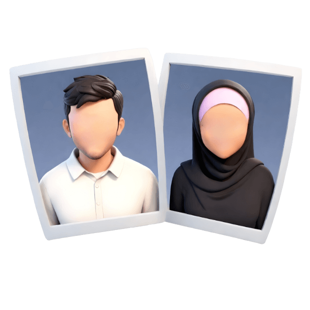
Wedding Couple

Assalamu’alaikum warahmatullahi wabarakatuh

Dengan memohon rahmat dan ridho Allah Subhanahu Wa Ta’ala,
insyaaAllah kami akan menyelenggarakan acara pernikahan :

Andy

Hermawan

Putra Pertama dari Keluarga
Bapak Lorem & Ibu Ipsum

Fauziah

Ratnasari

Putri Keempat dari Keluarga
Bapak Lorem & Ibu Ipsum

Minggu, 12 Desember 2024

The
Wedding
Days.

  • 00Hari
  • 00Jam
  • 00Menit
  • 00Detik

Akad Nikah

Friday, 05 Desember 201x

08.00 - 09.00 WIB

Mosque:
lorem ipsum dolor sit amet, consectetur adipiscing elit

Acara Resepsi

Sunday, 12 Desember 201x

08.30 s.d Selesai

Gedung Aula:
lorem ipsum dolor sit amet, consectetur adipiscing elit

Live Streaming

Kami juga berencana untuk mempublikasian pernikahan kami secara virtual melalui Zoom dan Live Instagram yang bisa anda ikuti melalui link berikut :

Wedding Gift

Tanpa mengurangi rasa hormat, bagi anda yang ingin memberikan tanda kasih untuk mempelai,
dapat melalui virtual account atau E-wallet

Penerima Kado: WeddingPress

Jl. Lorem ipsum dolor sit amet,
No.21 consectetur adipiscing elit.

bca.png
0812 345 678XX a.n Andy dari WDP
weddingpress
Salin Rekening
dana.png
0812 345 678XX a.n Andy dari WDP
weddingpress
Salin Rekening

Wedding Wish

Berikan Doa / Ucapan Terbaik Anda Kepada Kedua Mempelai

Tinggalkan kami doa terbaik anda untuk momen bahagia kami

[comment-kit style="golden"]

Hope to see you soon, Stay safe and healthy!

ADAB MENGHADIRI WALIMAH

Memberikan do'a restu terbaik kepada kedua mempelai.

(HR. Tirmidzi No. 1091)

Menggunakan pakaian yang sopan dan menutup aurat.

(QS. Al-Ahzab:59)

Memperhatikan waktu shalat dan tidak meninggalkan waktu shalat wajib.

(HR. Muslim No. 82)

Memperhatikan adab makan-minum. (Duduk, dengan tangan kanan, baca bismillah dan tidak mencela makanan)

(HR. Bukhari No. 3563)

Menghadiri undangan dengan niat untuk mengamalkan sunnah dan memuliakan saudara sesama mukmin.

(HR. Bukhari No. 5173)

Tidak berlebihan dalam makan dan minum, mengambil sesuai kebutuhan dan menghindari kemubadziran

(QS. Al-Isra: 26-27)

بَارَكَ اللهُ لَكَ وَبَارَكَ عَلَيْكَ وَجَمَعَ بَيْنَكُمَا فِى خَيْرٍ

Barakallahu laka wa baraka ‘alaika wa jama’a bainakuma fii Khoir

“Mudah-mudahan Allah memberkahi engkau dalam segala hal (yang baik) dan mempersatukan kamu berdua dalam kebaikan”

Terima Kasih

Atas Kehadiran & Doa Restunya

Merupakan suatu kehormatan dan kebahagiaan bagi kami sekeluarga apabila Bapak/Ibu/Saudara/i berkenan hadir untuk memberikan doa restu kepada kedua mempelai. Atas kehadiran serta doa restu, kami ucapkan terima kasih.

Sampai Jumpa di Hari Bahagia Kami,

Andy & Zhea

Keluarga Besar

Mempelai Pria

Bpk. Lorem Ipsum & Ibu Dolor Sit

Keluarga Besar

Mempelai Wanita

Bpk. Lorem Ipsum & Ibu Dolor Sit

Turut Mengundang:

Keluarga Besar Bpk. Putra & Ibu Putri
Keluarga Besar Bpk. Dewa & Ibu Dewi
Dan seluruh keluarga lainnya.

- WeddingPress Template #09 -
Undangan Pernikahan Digital Created By Weddingpress.co.id

Scroll to Top